Session 1: Today I will be covering the requirements for the Booklet Layout project. Following the discussion I will be looking at your Business Identity projects to give you feedback and answer any questions you’re having.
Project 3: Program or be Programmed Booklet Layout (10 points)
Due: Session 2, Week 11
Description
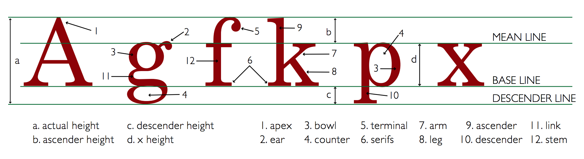
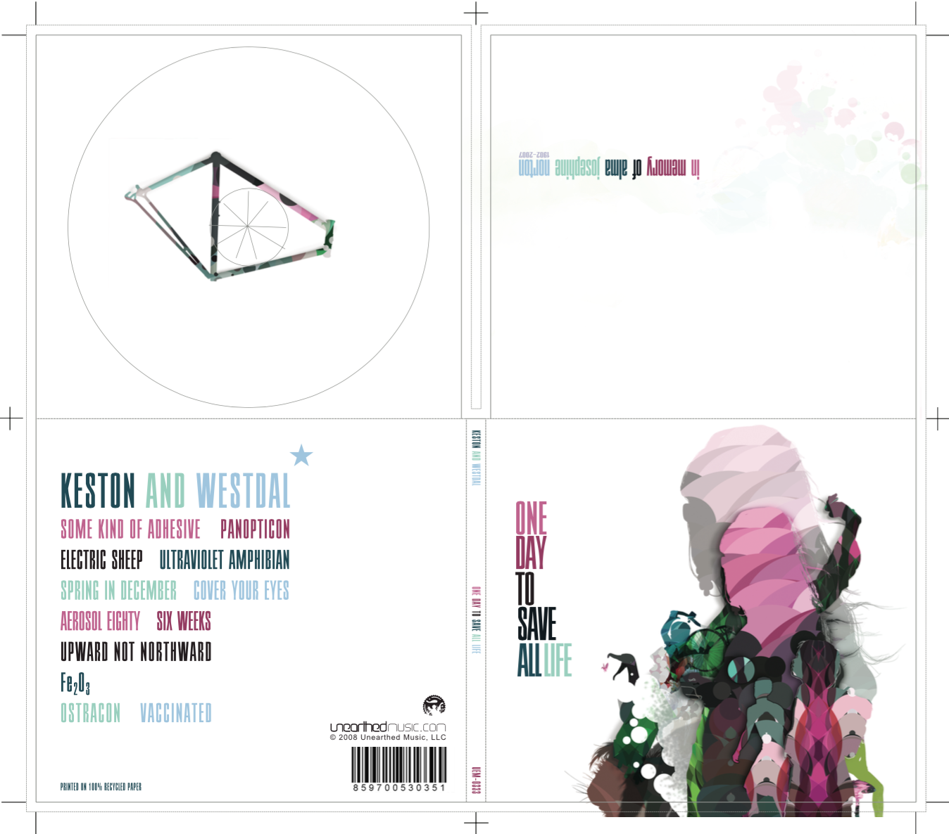
Typography, the meaningful arrangement of letterforms, is an essential component of design. In this assignment, we’ll study traditional principles of typographic design. The key concept for this exercise is to use page proportion and appropriate typography to create a composition that serves and complements the content. The final product will be a booklet containing a cover that you design, a title page, table of contents, and chapter 1 (not the whole book) of Program or Be Programmed by Douglas Rushkoff. Your cover composition will wrap around your booklet.
Downloadable Assets
Chapter 1 from Program or be Programmed by Douglas Rushkoff (for copy and paste)
Chapter 1 from Program or be Programmed by Douglas Rushkoff (.pdf example only)
Requirements
1. All should be reproducible in black and white, although color is acceptable for the cover
2. Before you do anything, download the text and read it!
3. Define text-block proportions that serve the text, and provide a comfortable setting for long-distance reading
4. Choose typography to express the internal organization of the text
5. Structure a relevant and understandable typographic hierarchy within your information design
6. Choose a type family appropriate for the content
8. Demonstrate basic document construction and page composition using Adobe InDesign
9. Produce polished text using correct special characters and character encoding
11. Vary typefaces within a type family to create contrast, order, and hierarchy
12. Printing and assemble the booklet to evaluate your work
13. Submit your .ai file and PDF to Canvas by session 2 of week 11
Point Breakdown
4 points may be earned for your attention to information design and type hierarchy
3 points may be earned for your document construction and typographic choices
3 points may be earned for your front and back cover composition
Session 2: Today I will be demonstrating the techniques required to complete the Booklet Layout Project. This includes setting up master pages, numbering pages, facing pages, asymmetrical margins, pasting across multiple pages, placing images, and using the text wrap panel. Following the InDesign lesson I will be covering the requirements for the last in our series of photo journal exercises.
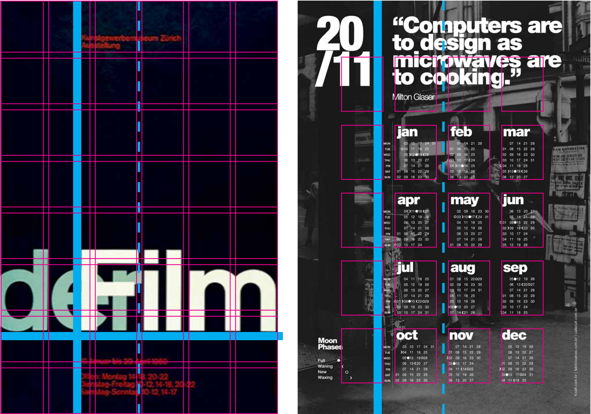
InDesign Lesson 3.0: Placing Images and Using Text Wrap
Creating a new half-letter document with facing pages
Using paste then shift+click force all the pages necessary
Reviewing paragraph styles
Separating text from the main content
Creating footnotes and superscript
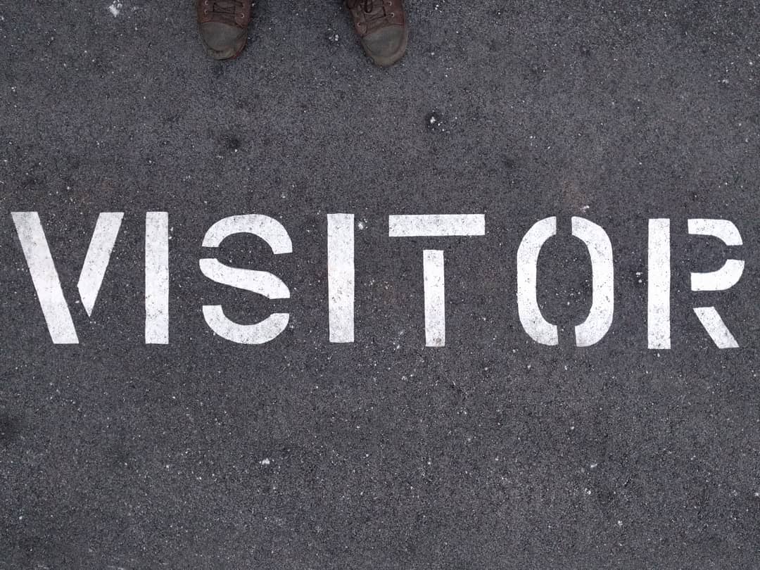
Photo Journal #3: Typography
Due: Session 2, Week 11 BEFORE CLASS (4 points)
Description:
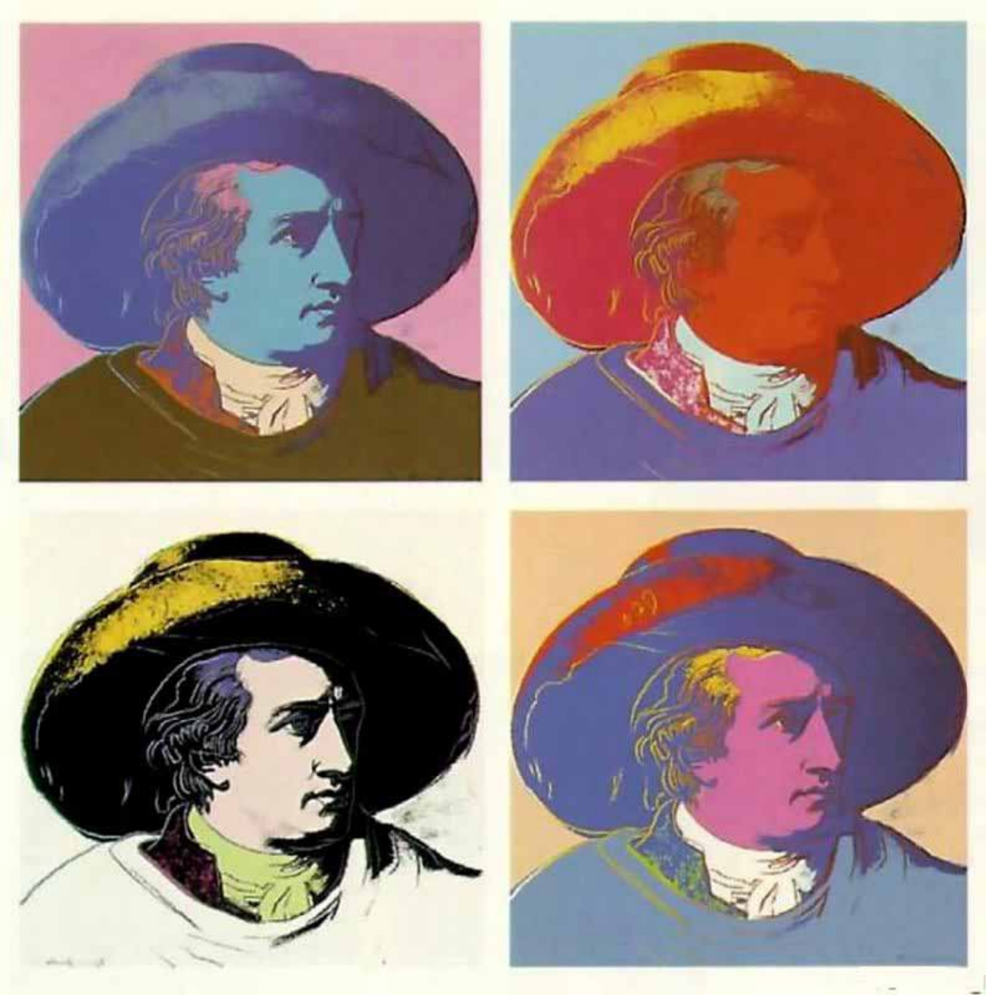
Although this is not a class about photography, it is a class about visual communication. Photography is a visual tool that allows us to see things in a different way. It is a technique for communicating ideas that cannot be easily expressed in words. These photo journal exercises are a way to train your eye to see things that you don’t usually consider. Type, letterforms, and iconography surround us constantly, yet how frequently do we analyze the shapes, lines, and curves that inform us about everything we encounter or learn about?
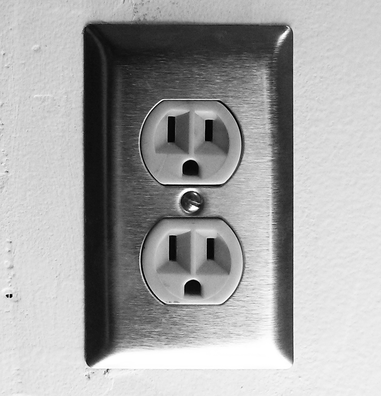
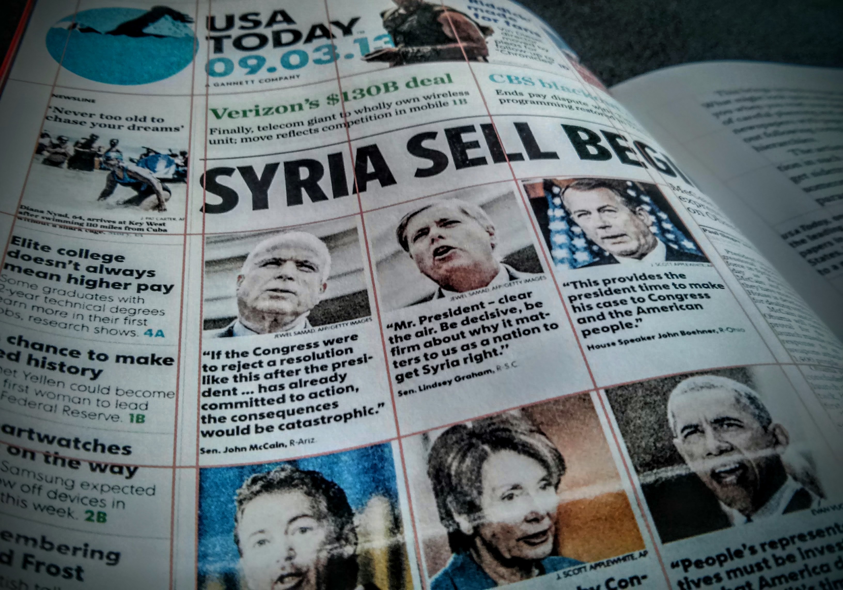
For this first exercise take a total of four photographs of type, letterforms, and/or icons exhibited in public spaces. Street signs are the obvious examples, but try to find uses that stand out in one way or another. Perhaps it is a message scrawled on a protesters sign, graffiti under a bridge, or a concert poster plastered to the wall of a dilapidated building. Remember that your living space is not public space! Get out of your comfort zone and find shots of things you might not otherwise encounter. Write one or two paragraphs about each photo explaining why you were compelled to take the shot, and why you think the designer chose the typeface or style that they did.
Requirements:
1. Design a document that includes four photos with text descriptions
2. Take four photos that are examples of typography, letterforms, and/or icons
3. Fins your examples in public spaces (get out of the house and off campus!)
4. Write one or two paragraphs of text describing each photo as requested above
6. Save your document as a PDF and upload it to Canvas before the due date/time
Points Breakdown: (6 points)
Four photos 3 points
Four descriptions 3 points